Real metal for a business card isn’t “extra.” It’s a decision about signal strength.
A metal card says something before your name does, sometimes too loudly, if you pick the wrong material or go overboard on shine. I’ve seen gorgeous metal cards that felt like jewelry… and I’ve seen “premium” cards that scratched into illegibility after two weeks in a front pocket. The difference is almost never the logo. It’s the material + finish + marking method, in that order.
One-line truth: metal cards are a tactile brand system, not a novelty.
The decision criteria (so you don’t shop blind)
Start with what the card must survive. Not what you want it to look like on a mockup. Reviewing real metal card examples can help you separate impressive visuals from practical choices.
Purpose dictates everything:
– If you hand out a lot of cards at events, comfort and readability win.
– If you hand out few, high-stakes cards (investors, luxury clients), drama and uniqueness matter more.
Then get brutally honest about:
Cost (the boring lever that controls all the fun)
Metal cards can vary wildly in price because every “upgrade” is compounded: thicker stock, exotic material, deeper engraving, specialty coatings, custom packaging. If budget matters, choose one hero feature and keep the rest restrained.
Durability and wear (the part vendors don’t lead with)
A card doesn’t live in a display case. It lives in wallets with keys, grit, and plastic edges. Finishes either hide micro-scratches, or advertise them.
A quick scoring system I use with clients
No spreadsheets required. Rate each option 1, 5:
– Legibility at arm’s length
– Scratch visibility
– Fingerprint tolerance
– Edge comfort (sharp corners feel “designer”… for 10 seconds)
– Brand match (warm vs clinical, legacy vs tech, etc.)
If a card looks elite but scores a 2 on legibility, it’s a collectible, not a business tool.
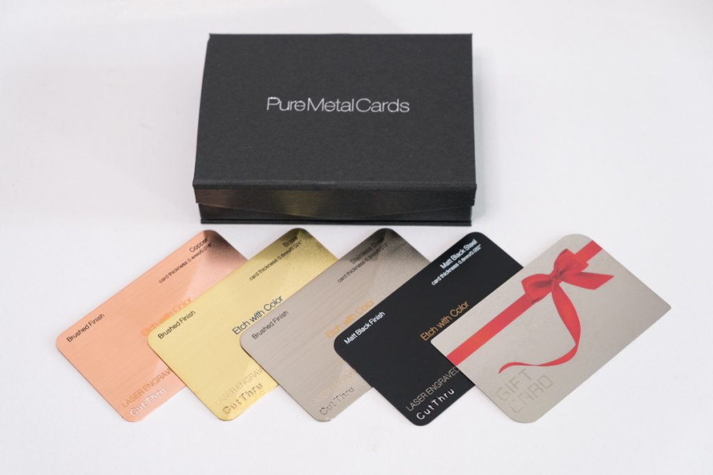
Stainless steel vs brass (and why the “best” one is contextual)
Steel: modern, disciplined, and hard to kill
Stainless steel is the safe bet when you want a clean, technical vibe that doesn’t age unpredictably. It tends to resist corrosion, and it doesn’t “evolve” much, which is exactly the point.
If your brand voice is crisp, think engineering, finance, cybersecurity, architecture, steel supports that story without trying to be charming.
Brass: warm, expressive, and happily imperfect
Brass reads human. It also changes. Patina is either gorgeous or annoying depending on your personality and your audience. In my experience, brass hits hardest for creatives, boutique studios, hospitality, high-end crafts, and brands that benefit from a little romance.
Now, this won’t apply to everyone, but: if you hate the idea of your card looking different in six months, skip brass.
My bias: brass is more memorable. Steel is more predictable. Choose based on which promise your brand needs to keep.
Finishes, textures, engraving: the “elite” look that lasts
Look, you can’t “design” your way out of a bad finish choice.
What wears well in the real world
– Brushed / satin: hides scratches, reduces fingerprints, feels intentional
– Matte: reads premium when done right, but coatings can scuff if cheap
– Mirror polish: high drama, high maintenance (and fingerprints love it)
Textures aren’t just aesthetics, they’re damage control. A subtle grain can make everyday wear disappear.
Engraving vs etching vs ink (pick for longevity, not convenience)
– Ink printing: best for full color and gradients; worst for abrasion over time
– Laser engraving: sharp lines, great for logos and text, strong longevity
– Etching: physically recesses the design; classic, permanent, “heirloom” vibe
If the card is supposed to last years, I usually steer toward laser or etch. Ink can work, but you’re accepting that frequent carriers will eventually rub it down.
A real stat to anchor the durability talk
Stainless steel’s corrosion resistance is largely due to its chromium content, at least ~10.5% chromium is the commonly cited threshold for “stainless” behavior, forming a protective oxide layer. Source: Encyclopaedia Britannica, “stainless steel” (Britannica.com).
That oxide layer is why steel tends to stay “presentable” with minimal babysitting.
Minimalist metal cards (simple doesn’t mean cheap)
Minimalism on paper is easy. Minimalism in metal is ruthless.
When you remove decoration, every tolerance matters: kerning, engraving depth, alignment, edge finish. A minimalist card should read in half a second and still reward a close look (that’s the trick).
A clean formula that works:
– One logo mark (small, perfectly placed)
– One typographic system (no mixing)
– One finish family (don’t fight yourself with competing textures)
And yes, negative space counts as a design element here. Use it like you mean it.
Industrial chic: sharp geometry, engineered personality
Hot take: industrial chic cards are the easiest to make look cool and the hardest to make comfortable.
Bevels, step-cuts, micro-knurling, angular corners, these details photograph beautifully and feel “machined.” They can also shred pockets and annoy people in actual use.
If you want this aesthetic, focus on controlled aggression:
– Chamfered edges instead of knife edges
– One geometric “move” (a corner cut, a notch, a perimeter frame)
– Contrast that’s readable, not just dramatic under studio lighting
Industrial chic works best when the card feels like a tool, not a blade.
Premium elegance (quiet luxury, not loud metal)
This is where restraint does the heavy lifting.
Brushed metals with micro-texture, subtle debossing, low-contrast engraving, done right, it feels expensive because it doesn’t beg for attention. Done wrong, it looks like a prototype.
Here’s the thing: luxury metal cards succeed on consistency. If your card is whisper-quiet but your typography is sloppy, the illusion collapses instantly.
A small detail I love: etched logo + polished edge. The edge catches light when the face stays calm. It’s understated, but people notice.
Practicalities: weight, thickness, and care (unsexy but decisive)
A card can be too heavy. Absolutely. There’s a point where it stops feeling “premium” and starts feeling like you’re trying to win a contest.
Durability considerations that actually matter
– Edge wear: corners take the first hit
– Finish hardness: coatings vary a lot; ask vendors what they use
– Wallet friction: if it’s meant to be carried, test it in a wallet for a week
– Readability after wear: light scratches can destroy thin typography
One-line emphasis: If you can’t read it when it’s scuffed, it’s not a business card.
Care that doesn’t feel obsessive
Wipe with a soft cloth. Mild soap + warm water for grime. Dry immediately. If it’s brass, expect patina, don’t panic (unless you truly want it bright forever, in which case you’ll be polishing more than you think).
Budgeting: the cost drivers nobody wants to admit
Most of the cost is driven by four things:
- Material (steel/brass/aluminum grades vary)
- Thickness and weight
- Marking method (etching and deep engraving cost more)
- Quantity (unit cost drops fast with volume)
Personalization, like individual names or QR/NFC programming, can add cost in sneaky ways. Sometimes it’s worth it. Sometimes it’s a vanity surcharge.
My usual recommendation: pick one premium feature (deep etch, custom cutout, specialty finish, or NFC), then keep the rest disciplined.
10 real-world metal card “case study” concepts (what works and why)
Not brand names, patterns I’ve seen succeed across industries.
- Stainless + laser engraving + matte face
Clean, tech-forward, durable. Perfect for high-handout environments.
- Brass + etched logo + intentional patina direction
Lean into aging; don’t fight it. Great for legacy craft brands.
- Black-coated steel + bright engraved text
High contrast, high drama. Just confirm coating durability with the vendor.
- Brushed metal + polished edges
Quiet luxury, very “executive.” People tend to keep these.
- Industrial notch detail + restrained typography
One geometric signature move. Anything more looks like a gimmick.
- Micro-texture face for fingerprint control
Surprisingly practical. Feels premium because it stays clean-looking.
- Ultra-minimal front, full info on back
Front is brand. Back is utility. Helps avoid clutter.
- Cutout logo used as a grip point
Functional design that also becomes a memorable moment.
- NFC + minimal printed info (just name and role)
Fast exchange, modern feel. Still include at least one human-readable contact method.
- Eco-forward story: recycled stainless + understated etch
Sustainability can be a real differentiator if you keep the design mature, not preachy.
The choice that usually wins
If you want the safest “I won’t regret this” build: stainless steel + brushed/satin finish + laser engraving. It’s readable, durable, and aligned with what most people interpret as modern premium.
If you want the most emotionally memorable build: brass + etch + controlled patina. It’s not for everyone. It is unforgettable when it fits.